
Creating the Site
January 22, 2026
As promised in the previous post, I’m here to discuss the actual creation of this website, and get more into the weeds of it.
I will say that I’m relatively new to the world of programming, so behind the scenes it might resemble a child’s drawing rather than a refined work of art. But that is okay (to me, the person who made the site); obviously I want it to be snappy and responsive and look nice for you, the user!
One of my favorite things about… well, just about anything is seeing something become optimized and improved over time. Hopefully, this site will see such upgrades!
The Site
Originally, and for a very brief time, I was going to try making this site in Python using Pelican.
That didn’t last very long; I hadn’t tinkered with Python at that point, and while I understand virtual environments now, I didn’t a few months ago. I saw Astro mentioned on a tech post on Reddit, looked into it, and the docs had a very built-in blog tutorial.
So, easy enough! I’m familiar with HTML, CSS and JavaScript, and have dabbled in React. So Astro was similar enough to that, and I quite like it. There was still a learning curve, but not as bad as trying to mess around in a programming language I hadn’t yet touched.
Anyway, the main site started out looking something like this:
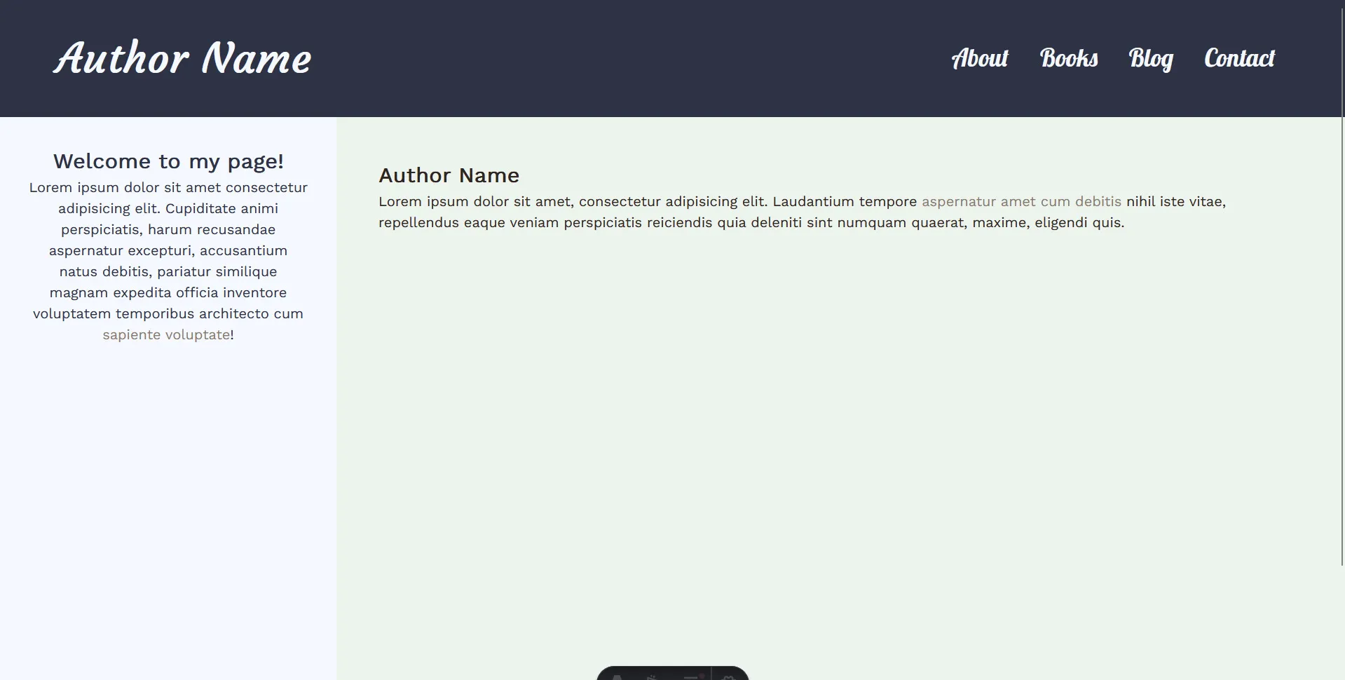
Very, very basic as you can see — but you can already see that I wanted to try out a layout that had a sidebar. I had some color scheme I ripped (basically blue and browns, with the pale lime background). I wanted something that looked ‘soft’ and neutral. I also like space/stars, so that was incorporated. All I can think of to call my theme is “cosmic latte”.
At this point in time, it looks like this:
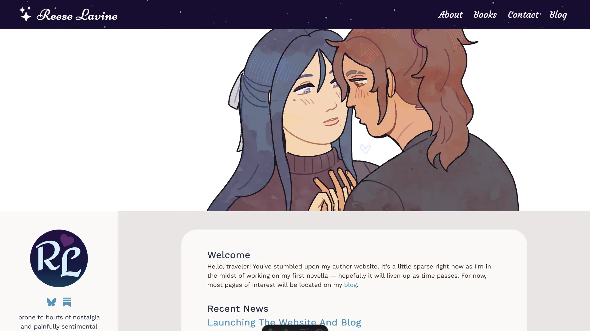
A few upgrades, but the general skeleton remains, even if the pale limey background color doesn’t. The sidebar was shrunk, as it took a bit too much real estate for something that only holds a logo, a few socials, and short text.
The banner is perhaps a placeholder — it depends if I’ll make the time to create new art to replace it before this site is up — but it has the function to go through a couple images, chosen at random per refresh.
It’s still a bit simple, but I don’t really need it to be much of anything else. This is my landing page for my author site, so it’s just providing some brief information and then sharing the most recent blog entry that is categorized as news, and then a list of titles and dates of the latest five blog entries.
I also added a component for a featured book, which will likely just have the latest release.
Besides that, there are the following pages (which are pretty much self-explanatory):
- About - just a short blurb about myself
- Books - a place for my future book listings… alas, currently barren
- Contact - contact info
And of course…
The Blog
Initially, the blog looked like this:
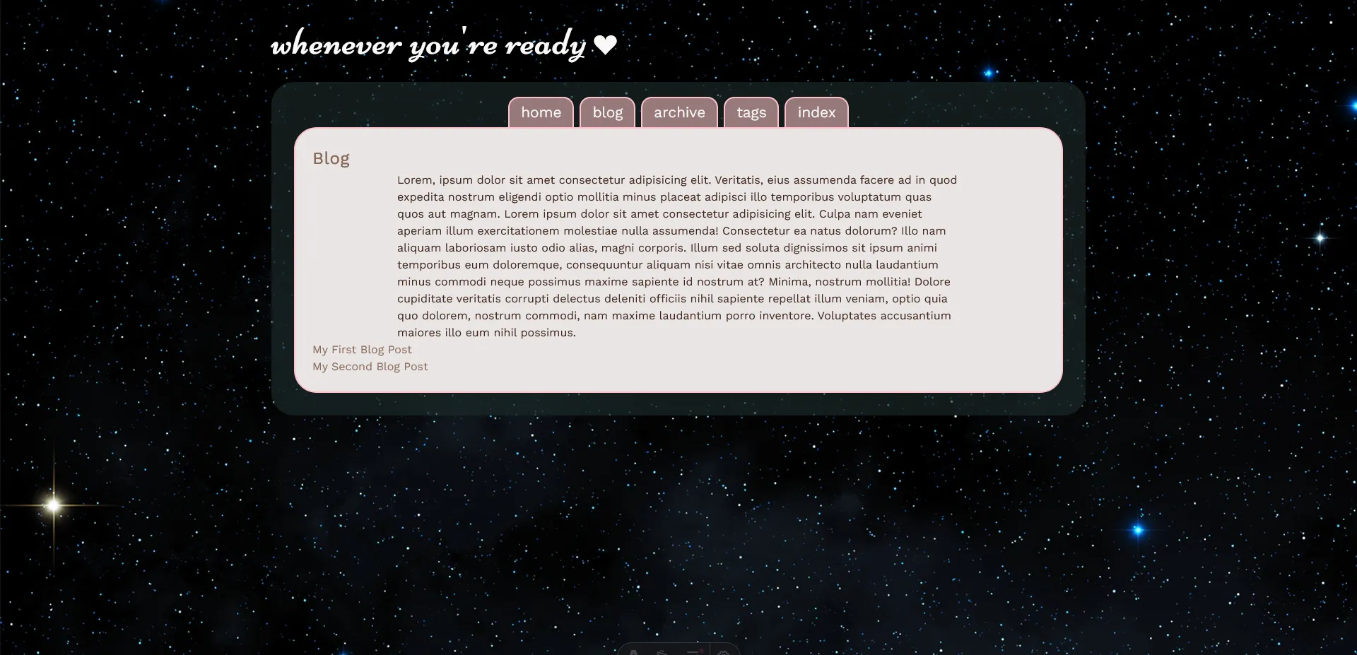
Yes, it’s a mess. But it’s funny because you can still see the remnants in its current iteration, just like with the homepage. If I were a better planner, I probably should have mocked this up but I went with my gut and just messed with the visuals as I plugged away at it.
Presently, the blog looks like this:
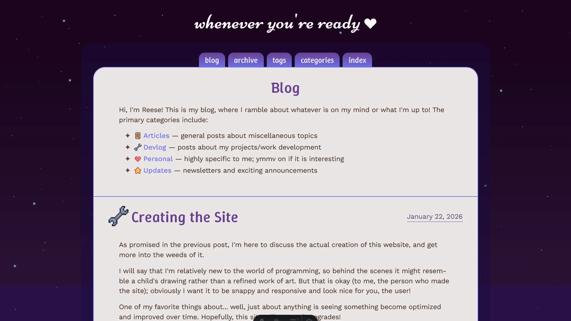
Not so bad, right? I replaced the stock space image into a pixel I made, fixed the color scheme (…it became very purple?), and of course, the text is placed where it should be.
I spent a lot of time on the blog, and while it’s relatively simple*, I’m quite happy with it.
*Well, with a lot of pain from me in the backend on what might’ve been easier for a seasoned programmer. I spent a lot of time fighting the excerpts on the main page because I didn’t want them to simply trail off mid-word with […] based on an inflexible character length, but article text had to be converted from Markdown into HTML to display properly; Astro has something that does this conversion for you, but renders the full article, so I had to scrabble something together using someone else’s tools and my own tweaks.
As it stands, they vary in length: the excerpt is for all text that appears before a line-break OR introduction of a heading, which is just as I wanted. What is programming if not fussing at one problem for hours, to reaching utter relief when it’s (mostly) solved?
There are a few changes I still want to make — the mobile view needs some fixing because of the nav bar — and I’m still pondering about putting an image on the right side of the blog title.
There’ll definitely be changes as time goes on. For the blog, I’ll maybe look into adding a comment section in the future. I thought about adding dark mode, but that’s also not a necessity, just a nice option to have.
But overall, I’m pleased! I made a functioning website! I used a framework as to not go crazy figuring out how to do blog stuff in vanilla HTML/CSS/JS, but the site pages themselves were still handcoded by me (lovingly, and perhaps messily).
Thanks for reading! ♡